Work completed
SJ (2003-2006)
2003-2004
SequenceJuxtaposer (SJ 2004) is a sequence browsing tool for exploring simiarities between aligned nucleotide sequences. Input to the browser is in fasta format files, which is a standard used widely by sequence analysis tools. The original goals of SJ was to provide an accordion drawing navigation tool that combined the tree structures of TreeJuxtaposer (TJ 2003) with the SJ view. The leaves of TJ are sequences, as is each sequence represented horizontally in SJ, and this alignment of tree and sequence view would give a great way of viewing the corresponding relationships between the topology and the sequence data.However, this project turned rather ambitious after most of the focus of my master's work was based on the underlying navigation and rendering infrastructure (ADNAV 2006 and PRISAD 2005). The original work of SJ was limited in capability, but also lacked an appropriately well-defined programming interface to communicate with the interface of TJ, which was also limited, perhaps non-existant.
2005-2006
The work in PRISAD 2005 on the rendering improvements for SJ was focused on aggregating data for improving rendering performance. The caching schemes used similarities between adjacent sequences as an advantage: aligned nucleotides often contain similar or identical nucleotides in a given position. SJ arranges sequences in rows, so a column of aligned nucleotides is the most efficient direction for the first stage of culling. A second pass of culling, done on the first rendering pass, creates a hierarchical aggregate column based on the partitioning tree used to perform layout and navigation (the split line hierarchy). Future rendering, which uses the hierarchy to determine what is large enough to be considered one pixel (or block), uses the cached values to later render columns as required. The rendering order is also determined with user navigations, so we draw inside user selected regions first, and fill in details if we have enough time to complete the rendering.
Work in progress
SJ2? (fosmid explorer?)
2006-
SJ annotation
How can we make SJ more useful by adding more structure? SJ in its current state is a simple browser for nucleotides, but often people want to see more information, at gene or amino acid level, perhaps. Furthermore, small multiples are an interesting approach to visualizing more than the simple nucleotide structure. There are 8 useful views that we may want to link together: the forward strand, the reverse (complement?) strand, and for each strand there are 3 offsets (open reading frames, ORF) for amino acids, any of which may be used to express genes. Showing mRNA transcriptions (the appropriate amino acids in each frame) gives 6 more representations, but perhaps this could be a toggle (either show the mRNA or ORF)? Heat map coloring to show protein marking, and other interesting features are things we may want to mine from genomic databases to present in a useful way. More research is required to know exactly what people want to see. Preliminary views of SJ by biologists produce more questions (i.e. can you do X, or load our dataset) than concrete directions.
SJ editing
A second improvement to SJ is editing. Most sequence browsers support simple editing, but lack in scalability. Making a useful editing interface (defining "useful" in itself is understated and often implied by non-domain or non-) would be an interesting research goal.
Steven Hallam collaboration
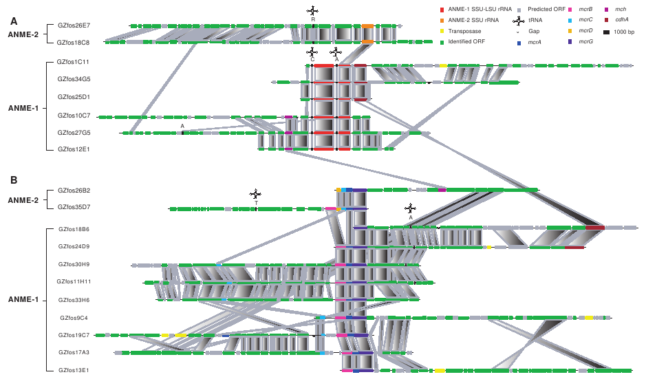
Collaborating with Steven Hallam, who has a lab at UBC, we want to see if we can use accordion drawing, or similar techniques, to explore a different type of dataset. This is a picture from Hallam et al. (Reverse Methanogenesis 2004):
- fosmid comparison (From Reverse Methanogenesis:..., Steven Hallam et al):

This figure was drawn "by hand" to show the relationships between 19 different genetic sequences. The similar parts are connected in each row by pologons, where shading gives directionality: an "X" with dark top and light bottom shows a flip in a particular gene, while a direct correspondance is more of a parallelogram (rectangle where possible). This is a picture from software developed at the Sanger Center (http://www.sanger.ac.uk/Software/ACT/![]() ):
):
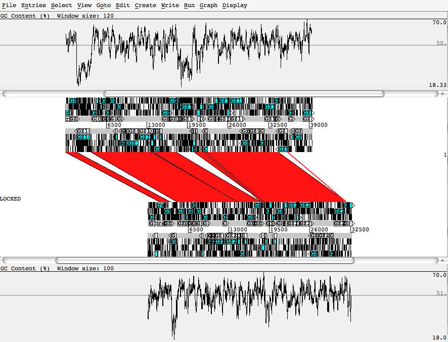
- blasted pair of sequences, using ACT from the Sanger Center.:

This figure shows different information in the comparison of 2 different sequences. The similarities are represented in the same way. The greater details are useful for investigating the sequences from their origins. However, the scalability of this system is limited. The length of sequences is restricted by the window size (no zoom function), and it only supports pairwise comparisons. A more robust interactive system that scales to show the details of the ACT system as well as a high-level "Hallam" view is desirable.


| I | Attachment |
History | Action | Size | Date | Who | Comment |
|---|---|---|---|---|---|---|---|
| |
AY714841vsAY714826_blastnOUT.png | r1 | manage | 57.1 K | 2006-11-29 - 17:41 | JamesSlack | blasted pair of sequences, using ACT from the sanger center. |
| |
hallamPic.png | r1 | manage | 70.4 K | 2006-11-29 - 17:30 | JamesSlack |

Ideas, requests, problems regarding TWiki? Send feedback